New brand identity
Kuyo Verpackungen, Berlin
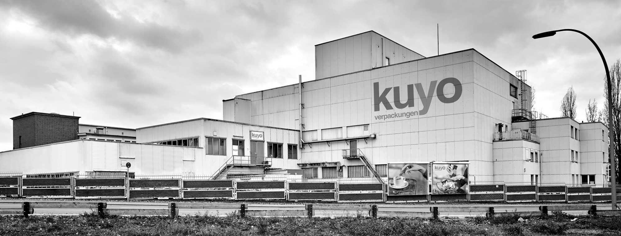
It is a company specialized in alimentary packaging. Kuyo woks with the most important brand to help them appearing in a good way, with expo gadgets and coherent graphic for the packaging.
1
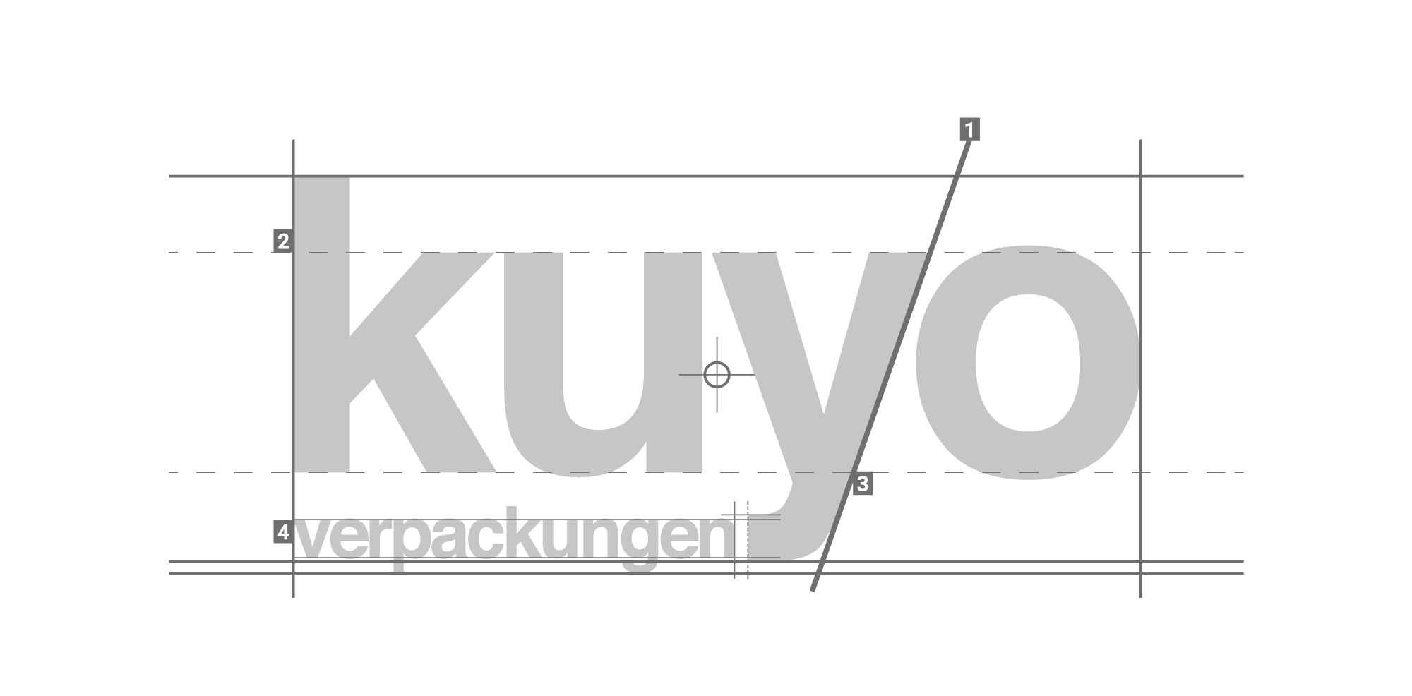
This oblique line gives to the entire shape a dynamic movement that focus the reader on the claim.
2
Letter K had a little alteration in terms of height, to be perfectly aligned with the other letters. Kuyo has also an adjusted line spacing.
3
Y is the most important letter. To use it like an arrow that points the claim, it undergoes some adjustments at the final lower part.
4
The claim has a different line spacing to have the chance to make it bigger. It is still readable, but it is easy to understand that is a claim that explain the brand’s business.
Brand Manual
The manual to learn how to use this logo
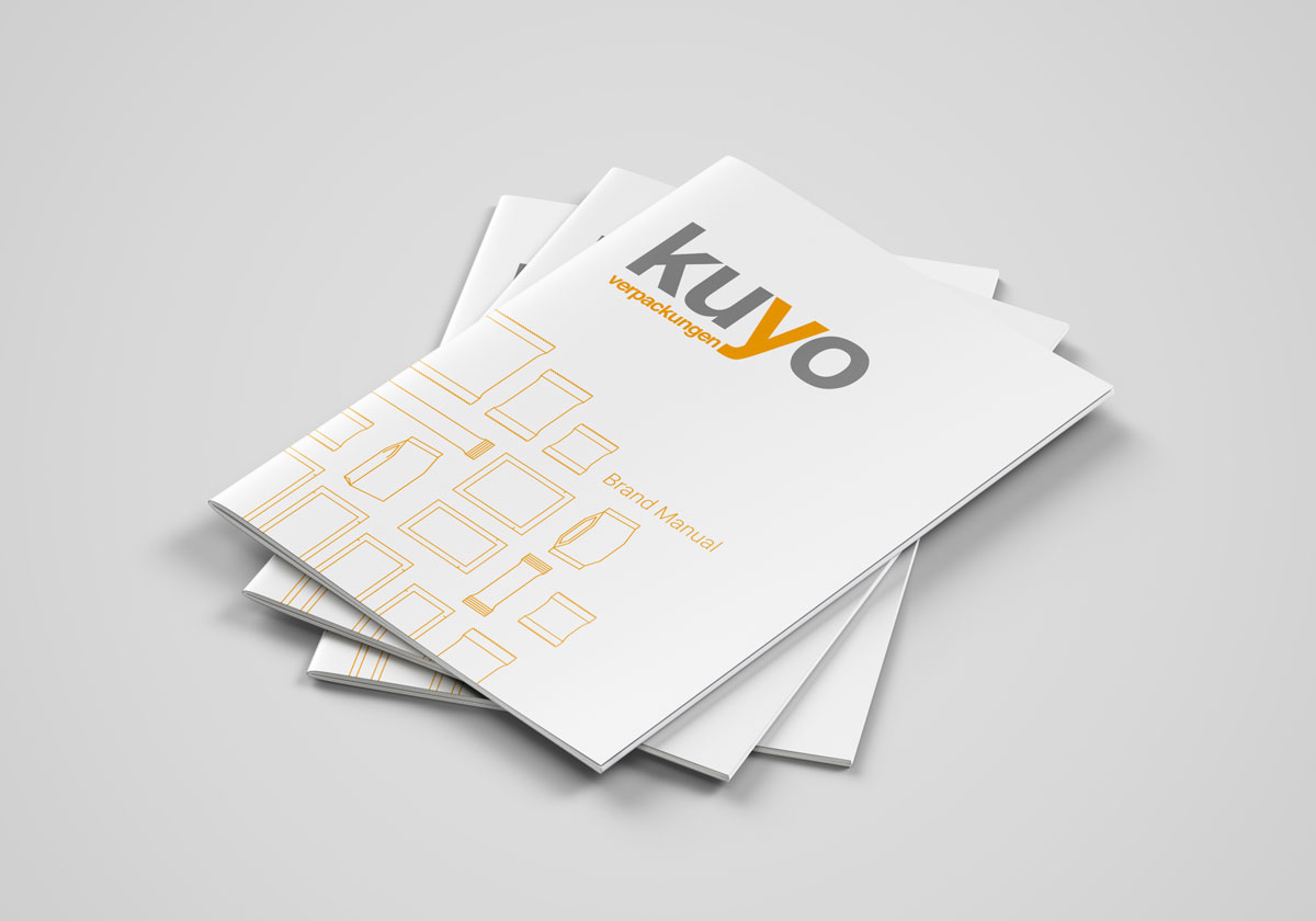
Kuyo asked for a complete manual studying all the rules to show its image in the right way. The cover presents an outline texture that represents the product that Kuyo cares more. The same texture will be used for other things like catalogs.
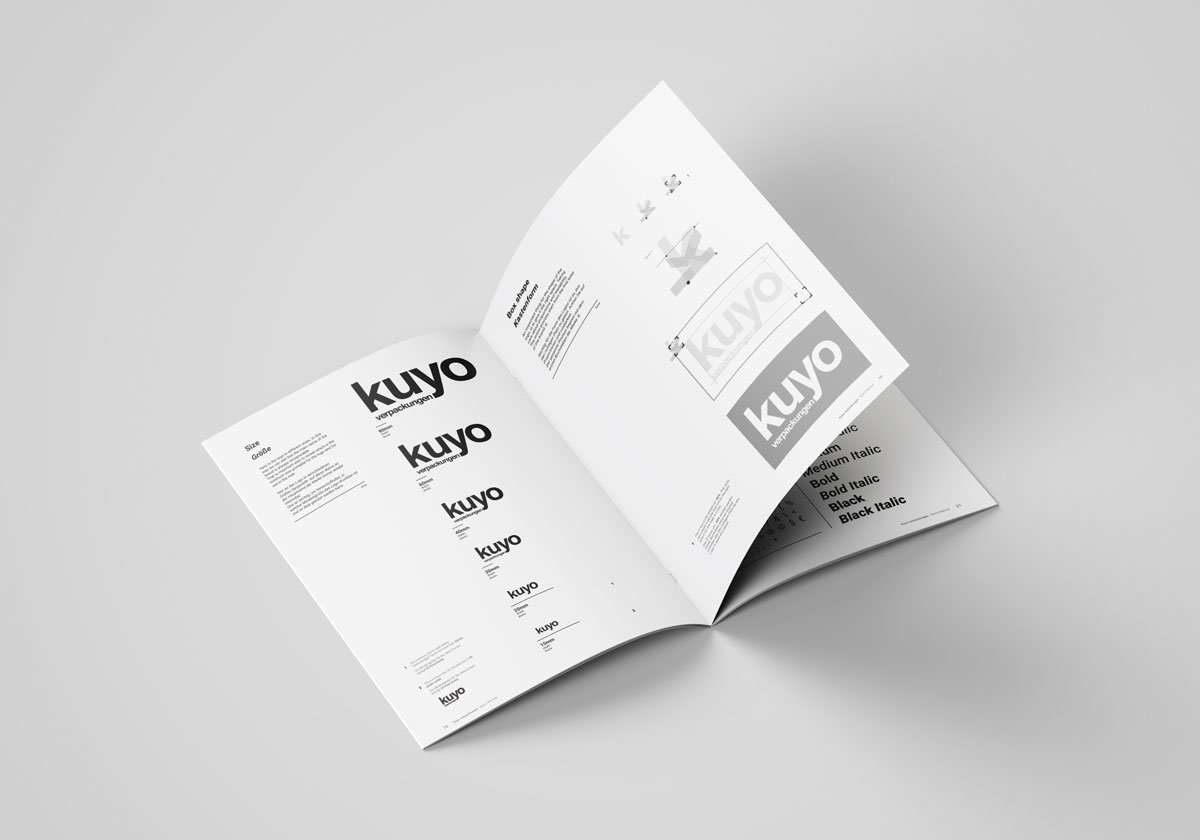
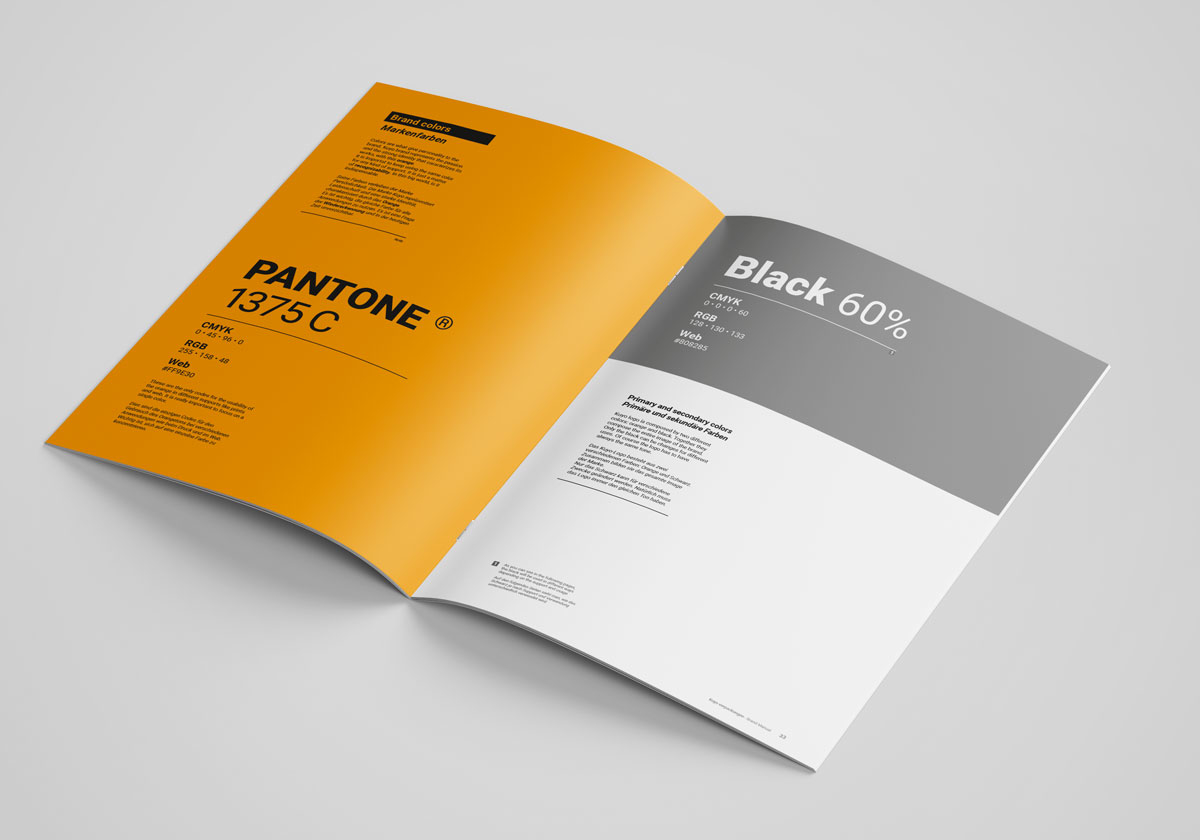
Dimensions, print and web usage, box shape and proportion,… everything to build up an entire image for the brand: fonts, style and of course colors.
Colors are what give personality to the brand and PANTONE play an important role in this field. Kuyo brand represents the passion and the strong identity that caracterizes its works, with this orange.
Website
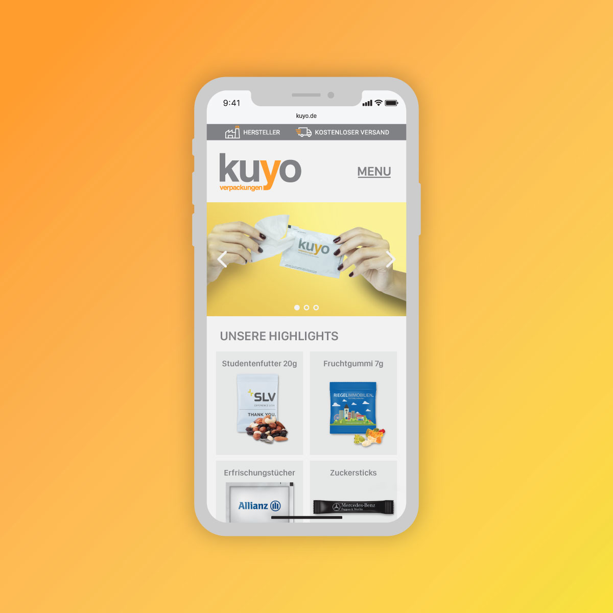
We are working on the digital communication
